Client & Project Overview
USA Lacrosse is the governing body for lacrosse across the United States. As such, they needed a publication arm of their website that accurately shows them as the leaders they are. They wanted their online magazine to become the go-to destination for lacrosse news, whether it be game coverage, special interest pieces, game schedules, and rankings.
HOW IT GOT DONE
*
HOW IT GOT DONE *
Step 1: Research
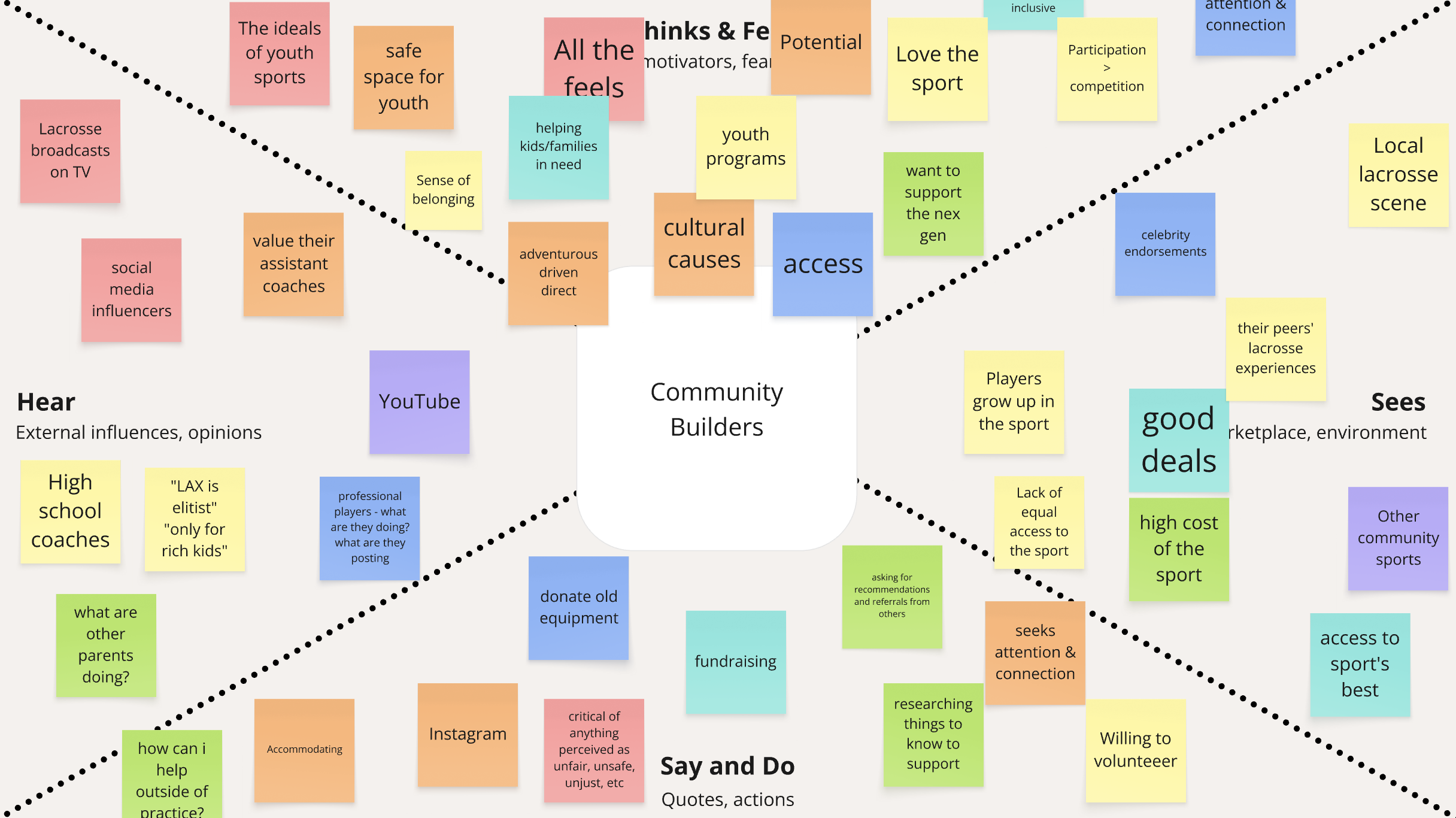
As is the case with every project I work on, research always comes first: understanding USA Lacrosse’s audiences, auditing their existing content structure, defining direction.
Some of this was research the USA Lacrosse team had already conducted. To make the best use of time (and money), I opt’d to expedite discovery through a series of workshops - specifically tweet writing, empathy mapping, and feature focuses (more about those workshops can be found in my blog post on Mindgrub.com).
This allowed all team members to quickly share knowledge and gain alignment.

Step 2: Strategize
Now that we had defined our goals, audiences, and direction, it was time to start planning. How do we get from where we are to where we want to get with minimal disruption?
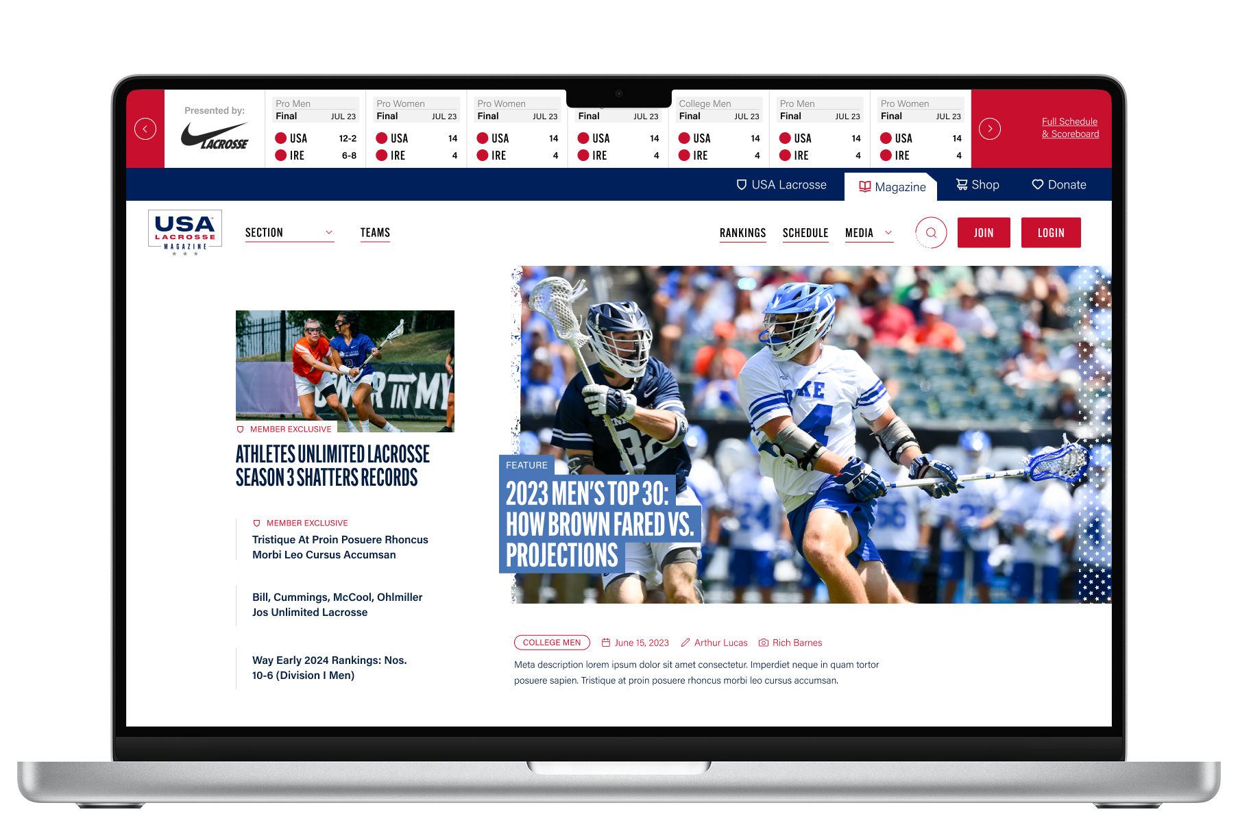
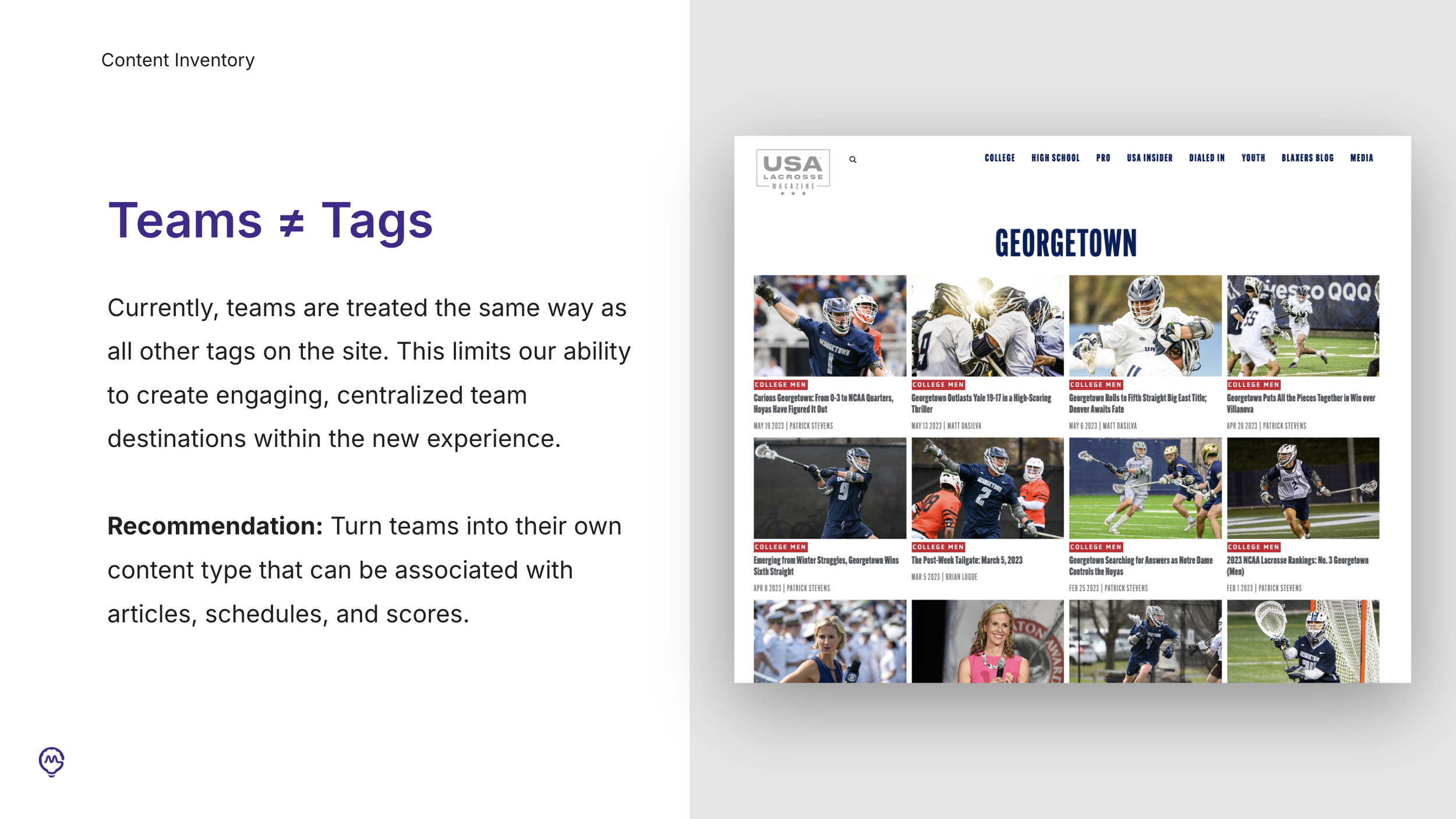
We started by developing a new content structure. We needed to expand beyond the standard publication structure of categories and tags with custom taxonomies; specifically for teams and leagues. This way, content could auto-populate where appropriate.
This also allowed us to create destinations out of team pages - offering users a centralized location to get all news, schedules, and rankings for specific teams.

Step 3: Design
Knowing that publishing articles was the primary purpose of the USA Lacrosse Magazine website, we opt’d for a primarily modular approach to design. By designing a series of components for articles, writers could create dynamic and engaging content that elevates the experience from being simply news to something experiential.
That said, certain pieces of the site needed to be more locked down - specifically team pages and schedules. By establishing a set structure, we ensure greater consistency for users as they navigate the site, plus streamline the content management process.


